Electronics & Tech
iPhone Case Packaging Solution: Suspended Display Design for Premium Accessory Brands
iPhone case packaging that solves the premium perception gap: suspended display structure with spot UV makes a accessory feel like a luxury purchase.
Why This Direction Works
What this packaging should do better
Faster first impression
Product value is not clear fast enough
Phone Cases & Accessories needs a visible category cue so buyers understand the product faster on shelf and in thumbnails.
Better product fit
Structure may not match the real product
window carton or rigid tray with suspended product presentation works best when the size, weight and fragile points are matched to the real product, not guessed from a generic pack.
More useful after opening
Unboxing does not support repeat use
The design should make opening, removal and storage easier so the packaging keeps adding value after the first unboxing.
Solution Visuals
How this packaging solves the problem
These panels show the packaging direction with clear callouts, detail zooms and side-by-side comparisons so buyers can quickly understand the structure, the opening experience and the shelf impact.
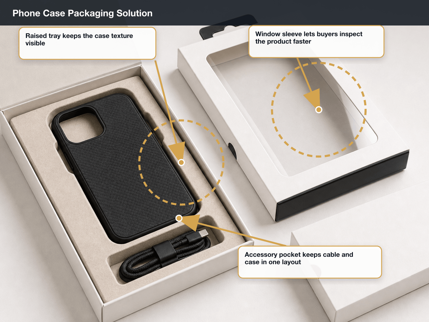
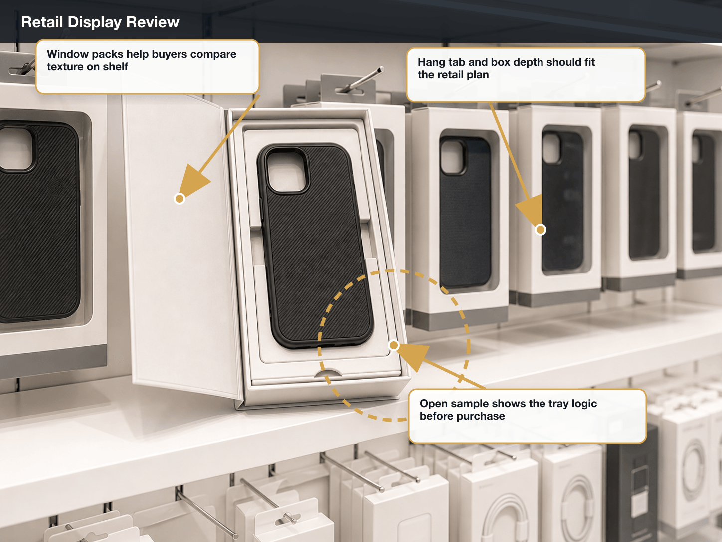
Detail image 1
Product hero angle
clear view, anti-scratch tray and retail hang/display planning -> communicates the product promise before opening.
Use front-panel cues, material signals and structure silhouette to clarify product positioning before opening.
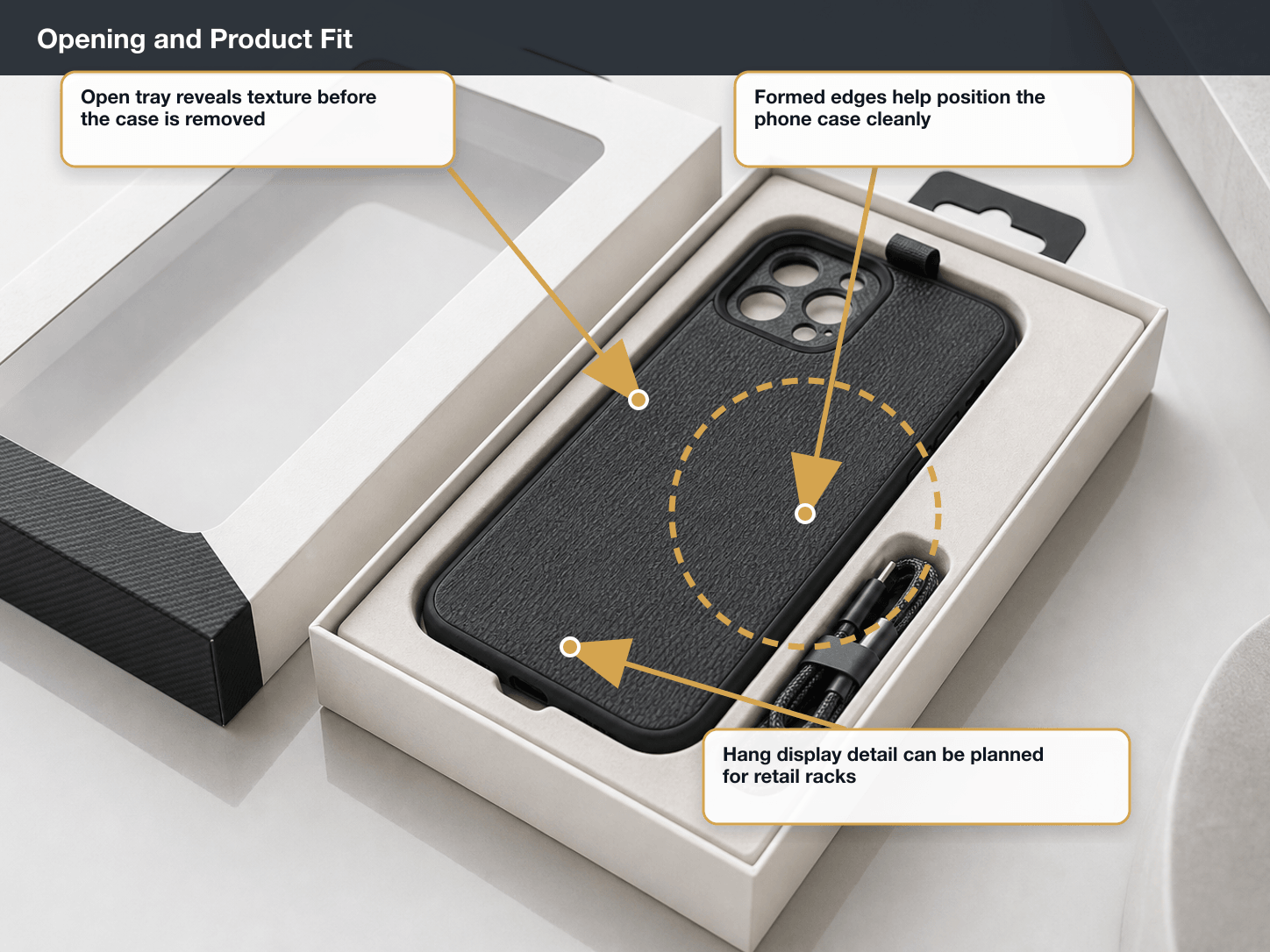
Detail image 2
Opening and fit logic
window carton or rigid tray with suspended product presentation helps the opening experience feel more controlled, clear and premium.
Show how the product sits inside the pack, how it opens and why the insert layout feels more deliberate.
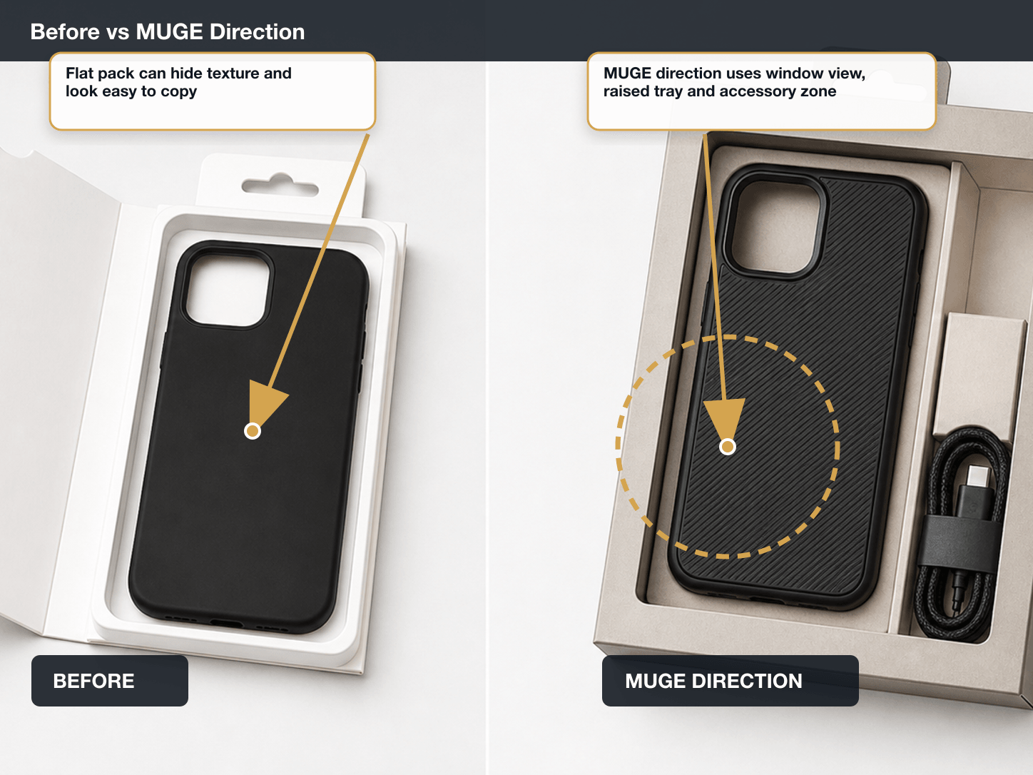
Detail image 3
Before vs After structure
Traditional packs often leave flat accessory packs hide product texture and feel easy to copy; this direction turns structure into a sales message.
Use the side-by-side comparison to show why the structure matters beyond a label change.
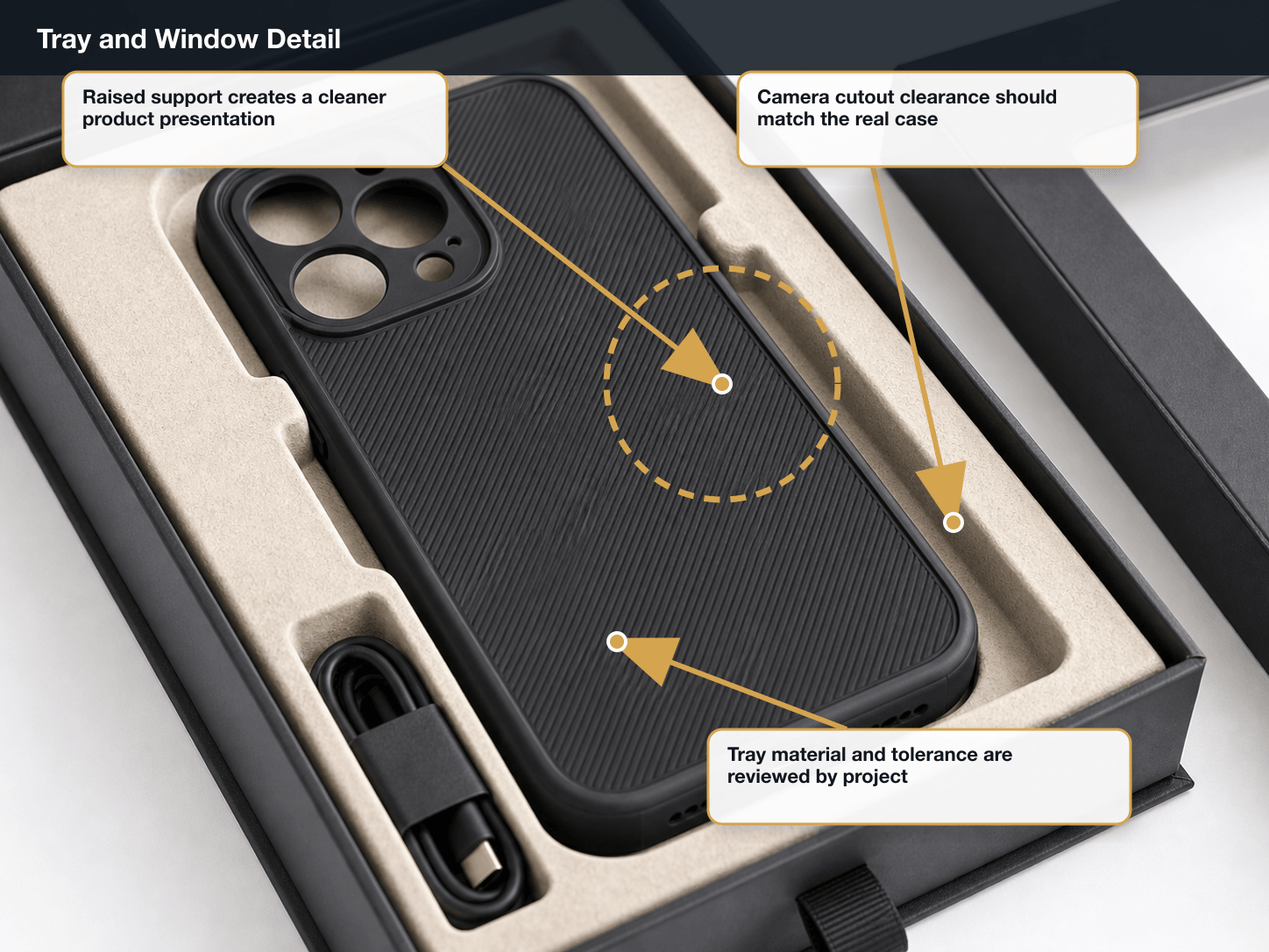
Detail image 4
Detail zoom
The key detail is clear view, anti-scratch tray and retail hang/display planning, shown close-up so the packaging idea feels concrete and useful.
Magnify the key construction detail so buyers can immediately see what improves the packaging experience.
Detail image 5
Retail shelf contrast
Phone Cases & Accessories needs a clear shelf block among similar products and listing thumbnails.
Review shelf and ecommerce thumbnail context before finalizing the visible packaging direction.
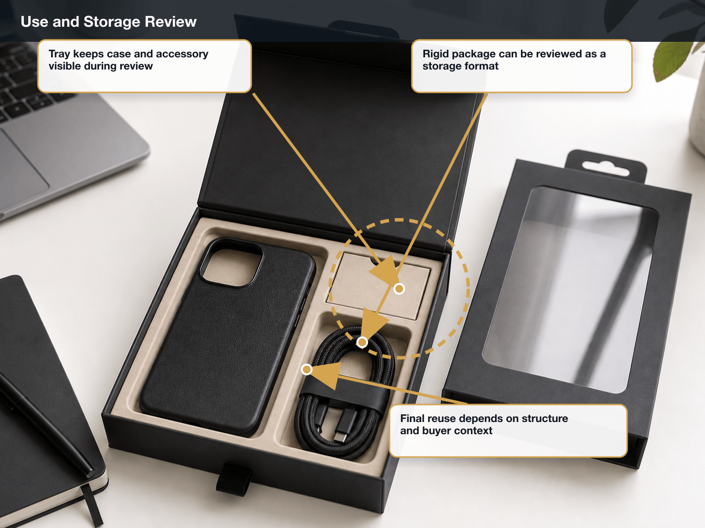
Detail image 6
Use and storage scenario
A useful package can remain visible after purchase when window carton or rigid tray with suspended product presentation supports storage or reuse.
Review not only first unboxing, but also whether the package remains useful after purchase.
Before / After
Traditional pack vs MUGE solution
This side-by-side view shows how the packaging can move from a generic pack to a more useful, better-presented and more memorable product experience.
| Review Area | Traditional Packaging | MUGE Solution Direction |
|---|---|---|
| Product fit | Often uses one generic cavity or oversized space. | Review a right-sized structure for phone cases and small accessories. |
| Buyer message | Mainly relies on printed label or logo. | Connect visuals to the real pain point: flat accessory packs hide product texture and feel easy to copy. |
| Detail communication | Key structure is not explained to the buyer. | Use callouts around clear view, anti-scratch tray and retail hang/display planning. |
| Quote readiness | Supplier receives vague style references. | Brief includes dimensions, quantity direction, finish, insert and sales channel. |
Applicable Products
Best-fit product list
- • phone cases and small accessories
- • products that currently suffer from flat accessory packs hide product texture and feel easy to copy
- • brand launch kits that need clearer product-fit review
- • retail or ecommerce projects where packaging must explain the product faster
- • sample-development projects that need structure, finish and insert notes before quotation
Next Pages
Explore matching products and materials
Related Solutions
Compare similar packaging directions
Electronics & Tech
Bluetooth Earbuds
small accessories feel cheap when cables and parts are loose. Review rigid or folding tech box with accessory tray.
Open related solution →Electronics & Tech
Electric Toothbrushes
chargers and brush heads feel messy without a controlled tray. Review rigid tech box or folding carton with accessory compartments.
Open related solution →Electronics & Tech
Laptop Sleeves
flat tech accessories bend and look generic without structure. Review flat mailer or rigid sleeve box with impact edges.
Open related solution →Next Step
Contact us to start the sample discussion
Send product size, quantity direction, artwork status, sales channel and packaging references. MUGE Packaging can then suggest a practical structure and the next sample step for this solution.
Contact Us to Get SamplesFrequently Asked Questions
What should buyers prepare for a Phone Cases & Accessories packaging discussion?
Prepare product size, product weight, photos, sales channel, target quantity direction, artwork status, finish references and any insert needs. These details help match window carton or rigid tray with suspended product presentation to the real product without guesswork.
Can this Phone Cases & Accessories solution be customized?
Yes. Structure, material direction, insert support, printing and surface finish can be adjusted by project. Final cost, quantity, timing and any compliance documents must be confirmed after the project details are checked.
Does this page confirm MOQ, lead time, certification or compliance?
No. This page shows a packaging direction only. MOQ, lead time, certification scope, food-contact use, destination-market compliance and final pricing require project-specific confirmation.