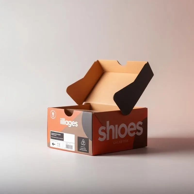
The Power of Less
Minimalist packaging is not about doing less—it is about doing exactly enough. Every element earns its place. Every material choice communicates intention. Minimalist design is the most difficult packaging aesthetic to execute because there is nowhere to hide imperfection.
Principles of Minimalist Packaging
Eliminate every element that does not serve the product or the brand. Let premium materials speak through texture rather than decoration. Use negative space as a design element, not an empty area. Typography as the primary visual element—no imagery, no patterns, just type.
Material Selection for Minimalism
Uncoated papers with natural texture providing visual and tactile interest without decoration. Single-color printing—often just black or white ink on natural substrate. Blind embossing for subtle, tactile branding visible only when light catches the raised surface.
Brands That Master Minimalism
Aesop, Glossier, and Le Labo demonstrate that minimalist packaging commands premium pricing through material quality and design restraint. The packaging communicates that the product inside is sufficient—no embellishment needed.
Implementation
Work with manufacturers who understand that minimalist packaging requires higher precision, not lower cost. Every edge, corner, and surface must be perfect because there is no graphic design to distract from manufacturing flaws.
Why Minimalism Works
In a retail environment saturated with color, pattern, and messaging, minimalist packaging creates visual silence. The customer attention that is not spent processing complex graphics is redirected to the product itself. That attention transfer is the ROI of minimalist design.
Looking for custom packaging for your brand?