Design Principles for Cosmetic Packaging That Converts
In beauty retail, the packaging IS the product until the customer opens it. Great cosmetic packaging design triggers desire within 3 seconds of shelf exposure.
The 3-Second Rule
Retail shoppers spend an average of 3 seconds scanning a shelf before deciding which product to examine. Your packaging must communicate brand identity and product benefit within that window.
Color Psychology for Beauty
White and gold signal luxury and clinical efficacy for premium skincare. Pastels communicate gentleness for natural and organic beauty brands. Black and metallic accents signal sophistication for prestige cosmetics. Bright colors with bold typography attract younger demographics.
Typography Hierarchy
Brand name as the most prominent text element with product name and key benefit as the secondary information tier. Ingredient callouts and certifications as trust-building tertiary elements.
Material and Finish Decisions
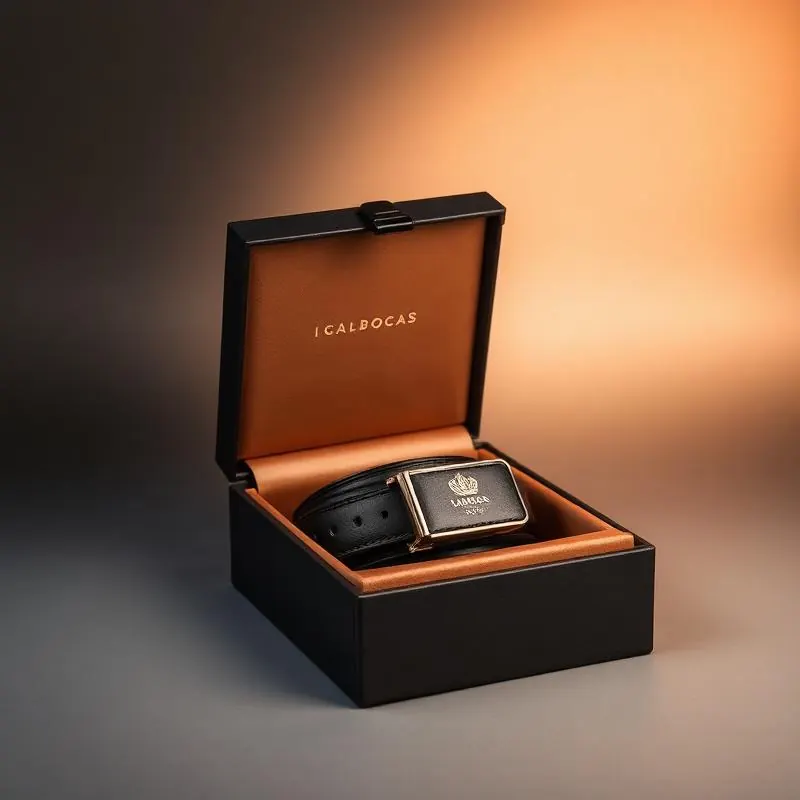
Soft-touch lamination communicates luxury and quality at first touch with foil stamping adding perceived value through metallic accents. Spot UV creates visual interest through gloss-matte contrast.
E-Commerce vs Retail Design
Retail packaging must work at shelf distance while e-commerce packaging must photograph well for product pages and unboxing content. The best designs optimize for both channels simultaneously.
Looking for custom packaging for your brand?